Appearance & theming
Three layers of styling control: grid-wide, per-column, and per-cell. Apply the lightest layer that gets the look you need.
Overview
The grid resolves a cell's visual appearance from three sources, in priority order from highest to lowest:
| Layer | Where it's set | Affects |
|---|---|---|
| Per-cell | Grid.Layouts[col, row] |
One specific cell. Overrides everything below. |
| Per-column | Grid.Columns[i].Appearance + AddSetting(gcsAppearance) |
All cells in that column. |
| Grid-wide | Grid.CellAppearance.<state>Layout |
Every cell, split by visual state. |
Each layout (TTMSFNCDataGridCellLayout) carries:
Fill— background fill (solid colour, gradient, …).Stroke— borders.Font— text font, colour, style.TextAlign/VerticalTextAlign— alignment.TextAngle— rotation in degrees.WordWrapping,Trimming,Sides(which borders to draw).
Quick example
procedure TForm1.FormCreate(Sender: TObject);
begin
  // Grid-wide override: focused cells get a red fill.
  Grid.CellAppearance.FocusedLayout.Fill.Color := gcRed;
  Grid.CellAppearance.SelectedLayout.Fill.Color := gcLightSteelBlue;

  // Per-column override: column 1 has its own focused style.
  Grid.Columns[1].Appearance.FocusedLayout.Fill.Color := gcGold;
  Grid.Columns[1].AddSetting(gcsAppearance);

  // Per-cell override (single cell affecting all states):
  Grid.Layouts[3, 3].Fill.Color := gcLime;
  Grid.Layouts[3, 3].Font.Style := [TFontStyle.fsBold];
  Grid.Layouts[3, 3].TextAlign := gtaTrailing;

  // Banded rows
  Grid.Options.Banding.Enabled := True;
  Grid.CellAppearance.BandLayout.Fill.Color := gcWhiteSmoke;

  // Adapt to the active TMS FNC application style (light/dark)
  Grid.AdaptToStyle := True;
end;
States
TTMSFNCDataGridCellAppearance exposes one layout per visual state:
| State | Layout property | When it applies |
|---|---|---|
| Normal | NormalLayout |
Every ordinary data cell. |
| Selected | SelectedLayout |
Cells inside the current selection. |
| Focused | FocusedLayout |
The single cell with keyboard focus. |
| Fixed | FixedLayout |
Header, footer, and fixed columns. |
| Fixed selected | FixedSelectedLayout |
Highlighted header for the selected column/row. |
| Group header | GroupLayout |
Group rows from Grid.Group(...). |
| Summary | SummaryLayout |
Group summary footers. |
| Banded row | BandLayout |
Alternate-row background when banding is enabled. |
| Filter match | FilterMatchLayout |
Cells matching the active filter (subtle highlight). |
Three patterns by use case
Application-wide style
Set defaults on Grid.CellAppearance once, ideally at form creation:
Grid.CellAppearance.SelectedLayout.Fill.Color := MyTheme.Accent;
Grid.CellAppearance.FocusedLayout.Fill.Color  := MyTheme.AccentBright;
Grid.GlobalFont.Size := 12;
Highlight one column
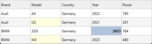
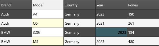
Grid.Columns[1].Appearance.NormalLayout.Fill.Color := gcLightYellow;
Grid.Columns[1].AddSetting(gcsAppearance);   // tell the column to own it
The second line is required — without it, the column reverts to the grid-wide appearance. The columns editor at design time adds this flag automatically.
Style one cell
Grid.Layouts[3, 3].Fill.Color := gcLime;
Grid.Layouts[3, 3].Font.Style := [TFontStyle.fsBold];
Grid.Layouts[col, row] always wins over column- and grid-level appearance
for that single cell.
Adapt to TMS FNC styles
Set Grid.AdaptToStyle := True to follow the active TMS FNC application
style (light, dark, or custom). Stops you from hand-coding a dark mode.
Banded rows
Grid.Options.Banding.Enabled := True;
Grid.CellAppearance.BandLayout.Fill.Color := gcWhiteSmoke;
Configure band width via Options.Banding:
| Option | Effect |
|---|---|
BandRowCount |
Number of rows that share the band colour before alternating. Default is 1. |
NormalRowCount |
Number of "normal" rows between band groups. Default is 1. |
Grid.Options.Banding.BandRowCount   := 2;   // two coloured rows ...
Grid.Options.Banding.NormalRowCount := 2;   // ... two white rows, repeat
OnGetCellLayout — dynamic per-cell styling
For "row 3 should be red only when status is overdue", use the event rather
than mutating thousands of Layouts[col, row]:
procedure TForm1.GridGetCellLayout(Sender: TObject; ACell: TTMSFNCDataGridCell);
begin
  if (ACell.Column = StatusColumn) and SameText(ACell.Text, 'Overdue') then
    ACell.Layout.Fill.Color := gcMistyRose;
end;
Condition-based cell styling with a bound dataset
When the grid is connected via TTMSFNCDataGridDatabaseAdapter, cell values
are stored in the dataset, not in the grid's internal dictionary. Reading
ACell.AsString inside OnGetCellLayout is therefore unreliable for data
columns — the cell may not have been loaded yet when layout is evaluated.
The reliable pattern is to move the dataset cursor to the row being painted
using SetActiveRecord, read the fields directly, and then restore the cursor:
procedure TForm1.GridGetCellLayout(Sender: TObject; ACell: TTMSFNCDataGridCell);
const
  STOCK_THRESHOLD = 50;
var
  SavedRec: Integer;
begin
  if ACell.Row = 0 then
    Exit;                                    // skip the header row
  if not Adapter.CheckDataSet then
    Exit;                                    // dataset not open or already navigating

  SavedRec := Adapter.DataLink.ActiveRecord;
  try
    if Adapter.SetActiveRecord(ACell.Row) then
    begin
      if ClientDataSet1.FieldByName('IsOrganic').AsBoolean then
        ACell.Layout.Fill.Color := $FFE0FFE0;   // green tint for organic products

      if ClientDataSet1.FieldByName('Stock').AsInteger < STOCK_THRESHOLD then
      begin
        ACell.Layout.Fill.Color := $FFFFE0E0;   // red tint for low stock
        ACell.Layout.Font.Color := gcRed;
      end;
    end;
  finally
    Adapter.DataLink.ActiveRecord := SavedRec;  // always restore the cursor
  end;
end;
Key points:
Adapter.CheckDataSetreturnsFalsewhen the dataset is closed or while the adapter itself is navigating — guard against this to avoid recursion.Adapter.DataLink.ActiveRecordholds the index of the "active" record in the data link buffer. Save it before callingSetActiveRecordand restore it in thefinallyblock, or the grid and dataset will be out of sync.SetActiveRecord(ACell.Row)returnsTruewhen the move succeeded; only read field values inside theifblock.- The same pattern applies to
OnGetCellProperties,OnBeforeDrawCell, and any other per-cell event where you need to read live dataset values.
Combining banded rows, condition-based styling, and per-column appearance
This example enables alternating bands, applies a column-level background to the
status column, and then uses OnGetCellLayout to override the row color based on
the status value — all three styling layers in one setup:
procedure TForm1.FormCreate(Sender: TObject);
begin
  // Layer 1: alternating row banding (grid-wide)
  Grid.Options.Banding.Enabled      := True;
  Grid.Options.Banding.NormalRowCount := 1;
  Grid.Options.Banding.BandRowCount  := 1;

  // Layer 2: column-level default appearance for the Status column
  Grid.Columns[StatusColumn].Appearance.NormalLayout.Fill.Color := $00E8F4FF;
  Grid.Columns[StatusColumn].AddSetting(gcsAppearance);

  // Layer 3: per-cell conditional formatting wired in OnGetCellLayout
  Grid.OnGetCellLayout := GridGetCellLayout;
end;

procedure TForm1.GridGetCellLayout(Sender: TObject; ACell: TTMSFNCDataGridCell);
var
  Status: string;
begin
  if ACell.Row <= 0 then Exit;          // skip header row

  Status := Grid.Strings[StatusColumn, ACell.Row];

  if Status = 'Overdue' then
  begin
    ACell.Layout.Fill.Color   := $000000FF;  // red
    ACell.Layout.Font.Color   := gcWhite;
    ACell.Layout.Font.Style   := [fsBold];
  end
  else if Status = 'Done' then
  begin
    ACell.Layout.Fill.Color   := $0000CC00;  // green
    ACell.Layout.Font.Color   := gcWhite;
  end;
end;
Related API
TTMSFNCDataGridCellAppearanceTTMSFNCDataGridCellLayoutGrid.Columns[i].Appearance+AddSetting(gcsAppearance)Grid.Layouts[col, row]Grid.GlobalFontGrid.AdaptToStyleGrid.Options.Banding.Enabled/BandRowCount/NormalRowCountOnGetCellLayout,OnGetCellLayoutHasPriorityTTMSFNCDataGridDatabaseAdapter.CheckDataSet— guard before navigatingTTMSFNCDataGridDatabaseAdapter.SetActiveRecord(ARow)— move cursor for layout eventTTMSFNCDataGridDatabaseAdapter.DataLink.ActiveRecord— save/restore cursor position
See also
- Custom cells — for shapes beyond fill/font/border.
- Cell controls — embed live controls.
- Data binding — connecting the adapter.
- Editing cells — pairs naturally with appearance overrides.