Designing conditional formatting rules in the IDE
Everything the other chapters describe can also be done visually, without writing
the rule code at all. The DataGrid ships a design-time conditional-formatting
editor for VCL and FMX that edits the same ConditionalFormatting collection
and streams the result into the form file, so a rule set built in the IDE behaves
identically to one built in code — and a rule set built in code opens in the
editor for tweaking.
Reach for the editor when you are designing the look: picking colors, trying thresholds, ordering rules, and judging a color scale by looking at it rather than imagining it. Reach for code when the rules depend on runtime data — a column index the user chose, a threshold read from settings, a rule set that varies per document.
Opening the editor
There are two ways in, both on a selected grid:
- Object Inspector — the
ConditionalFormattingproperty shows the current rule count,(3 rules), and its ellipsis button opens the editor. The same property editor is registered forTTMSFNCDataGridRendererSource, so a headless renderer's rules are editable the same way. - Context menu — right-click the grid and choose Conditional Formatting Rules ….
The editor window
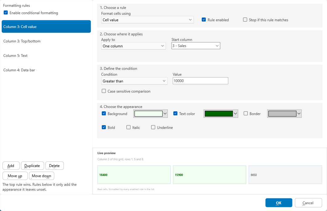
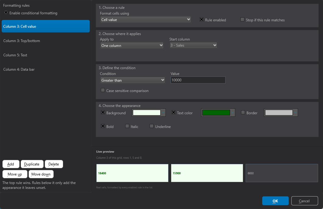
The window is split. On the left is the rule list with Add, Duplicate,
Delete and Move up / Move down, plus an Enable conditional
formatting checkbox that maps to ConditionalFormatting.Enabled — a way to turn
the whole collection off without deleting anything. On the right, the selected
rule is edited as a form in four numbered steps, and below it a live preview.
| Step | Contents |
|---|---|
| 1. Choose a rule | Rule type, whether the rule is enabled, and StopIfTrue ("Stop if this rule matches"). |
| 2. Choose where it applies | Scope, with the column, end-column and row selectors the chosen scope needs. |
| 3. Define the condition | Whatever that rule type compares on: a comparison and its one or two values, a relative date bucket (with From / To pickers for Custom range), a rank, an average kind, an icon family, a bar direction, or an expression with the Build… builder. |
| 4. Choose the appearance / Configure the visual | For appearance rules: fill, text and border colours plus bold / italic / underline. For visual rules the step relabels itself and shows the colours, the bound configuration, and the per-type options instead. |
Every setting of every rule type is reachable here — the editor has no separate "advanced" page and nothing is hidden behind one.
The designer adapts to the rule type
Steps 3 and 4 are not a fixed form: they are rebuilt for the selected rule. With a
color scale selected, step 3 collapses to a single explanatory line (the scale has
no comparison to configure) and step 4 becomes Configure the visual — three
colour swatches with a Lowest point / Midpoint / Highest point bound
selector under each, mapping directly to MinKind/MidKind/MaxKind and their
values, plus the Use a three-color scale checkbox for ThreeColor.
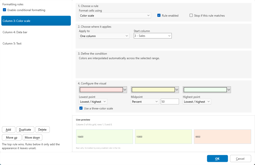
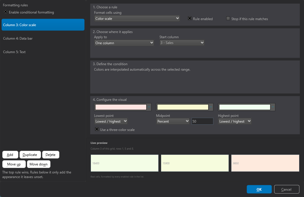
Compare the two captures: same window, same four steps, but a cell-value rule asks
for a Condition and a Value and offers background / text / border colours,
while the colour scale asks for bounds and offers the gradient stops. That is the
editor reading RuleType and showing only what that type actually has.
Two things that make it more than a property sheet
It reads the grid's renderer, so the column selectors list your real column
captions (3 - Sales) instead of bare indices, row ranges are validated against
the grid, and the expression builder offers the identifiers this grid actually
understands.
And the live preview at the bottom renders the selected rule against real cells from your grid — the caption names which ones ("Column 3 of this grid, rows 1, 5 and 8") — run through the real formatting engine, not a mock-up. It updates as you change any setting, so a colour scale or icon set is judged by looking at it. When the grid has no usable data the preview falls back to three synthetic sample cells rather than showing nothing.
Rule order is priority
The list order is the evaluation order, and the hint under the buttons states the merge rule the same way this guide does:
The top rule wins. Rules below it only add the appearance it leaves unset.
So Move up makes a rule win a contested aspect, and Move down yields it.
This is the visual equivalent of lowering a rule's Priority value — see
How overlapping rules merge
for what "wins" means per aspect.
Applying and discarding
OK writes the edited rules back to the component and marks the form modified;
Cancel discards everything. The editor works on a copy of the collection,
so a session you cancel leaves the existing rules untouched — including the
Enable conditional formatting checkbox and any reordering you tried out.
Note
Rules created in the IDE are streamed into the .dfm / .fmx file. If you also
build rules in code at run time, call Grid.ConditionalFormatting.Clear first
unless you intend to add to the designed set — otherwise both sets apply and the
merged result is rarely what you meant.
Offering the editor at run time
The editor is an ordinary component, not an IDE-only artefact, so the same
dialog can be handed to end users — a reporting screen where they colour their
own thresholds, for example. Execute works on a copy and writes back only on
OK, so a cancelled session needs no undo logic of your own.
procedure TForm1.EditRulesClick(Sender: TObject);
var
  Editor: TTMSFNCDataGridConditionalFormattingEditor;
begin
  { The design-time editor is an ordinary component, so the same dialog can be
    offered to end users at run time. Add
    FMX.TMSFNCDataGridConditionalFormattingEditor to the uses clause. }
  Editor := TTMSFNCDataGridConditionalFormattingEditor.Create(Self);
  try
    { Execute works on a COPY of the rule collection: it returns True and writes
      the rules back only when the user confirms, so Cancel leaves the grid's
      existing rules untouched and needs no undo handling here. }
    if Editor.Execute(Grid) then
      Grid.Invalidate;
  finally
    Editor.Free;
  end;
end;

procedure TForm1.EditRendererRulesClick(Sender: TObject);
var
  Editor: TTMSFNCDataGridConditionalFormattingEditor;
begin
  { For a headless renderer or a renderer source there is no grid to pass -
    assign the renderer instead and call the parameterless overload. }
  Editor := TTMSFNCDataGridConditionalFormattingEditor.Create(Self);
  try
    Editor.Renderer := RendererSource.Renderer;
    if Editor.Execute then
      Grid.Invalidate;
  finally
    Editor.Free;
  end;
end;
using namespace Fmx::Tmsfncdatagridconditionalformattingeditor;
void __fastcall TForm1::EditRulesClick(TObject *Sender)
{
  /* The design-time editor is an ordinary component, so the same dialog can be
     offered to end users at run time. Include
     FMX.TMSFNCDataGridConditionalFormattingEditor.hpp. */
  TTMSFNCDataGridConditionalFormattingEditor *Editor = new TTMSFNCDataGridConditionalFormattingEditor(this);
  try
  {
    /* Execute works on a COPY of the rule collection: it returns true and writes
       the rules back only when the user confirms, so Cancel leaves the grid's
       existing rules untouched and needs no undo handling here. */
    if (Editor->Execute(Grid))
      Grid->Invalidate();
  }
  __finally
  {
    delete Editor;
  }
}

void __fastcall TForm1::EditRendererRulesClick(TObject *Sender)
{
  /* For a headless renderer or a renderer source there is no grid to pass -
     assign the renderer instead and call the parameterless overload. */
  TTMSFNCDataGridConditionalFormattingEditor *Editor = new TTMSFNCDataGridConditionalFormattingEditor(this);
  try
  {
    Editor->Renderer = RendererSource->Renderer;
    if (Editor->Execute())
      Grid->Invalidate();
  }
  __finally
  {
    delete Editor;
  }
}
Common mistakes
- Expecting the last rule to win. The list is ordered most-important-first. If a highlight is not appearing over a color scale, move it up, not down.
- Editing rules on the wrong component. A grid fed by a renderer source keeps its rules on the renderer; open the editor from the source component, not from the grid that displays it.
- Expecting a cancelled session to have applied something. Nothing is written until OK — including deletions and reordering.
- A rule that previews correctly but formats nothing at run time. The preview samples a few rows; a rule scoped to a column range or a cell range may simply not contain the rows you are looking at. Check step 2 before suspecting the condition.
See also
- Conditional formatting overview
- Scope and priority
- Renderer source — editing rules for a headless renderer
- API reference: TTMSFNCDataGridConditionalFormatting